La nouveauté Fretly est arrivée, et comme vous avez pu le constater, nous vous avons confectionné un comparateur de grilles tarifaires afin de faciliter votre choix de transporteurs les plus adaptés !
Le comparateur de grilles tarifaires de Fretly, comment ça marche ?
C’est simple, l’accès est totalement gratuit.
Vous importez vos grilles sur notre plateforme en ligne et vous visualisez immédiatement votre comparaison ! La grille tarifaire déposée sera modélisée en seulement quelques jours.
Le point de vigilance afin que vos grilles soient modélisées correctement :
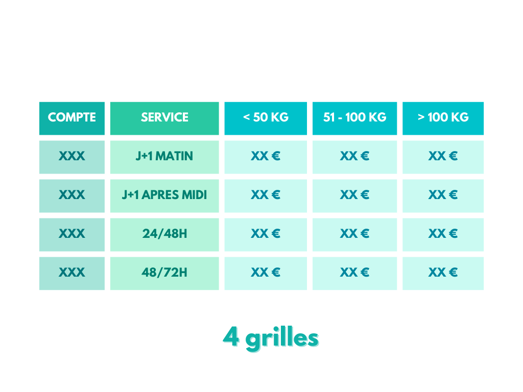
Une grille tarifaire, c’est une représentation sous forme de tableau, contenant des conditions, des prix et des informations complémentaires venant d’un transporteur.
Par exemple, voyez cela comme un fichier Excel qui contiendrait un tableau dans lequel vous pourrez retrouver les prix d’une expédition en fonction de son poids ou de sa quantité de colis/palettes, au départ d’un lieu et d’une destination géographique donnés.
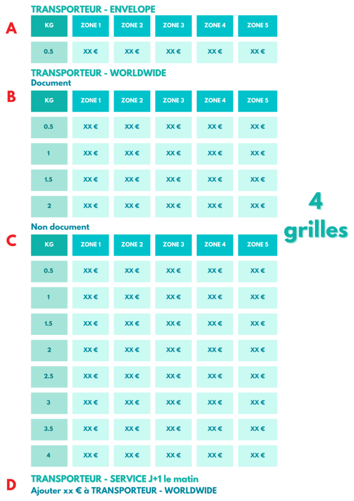
Attention : Chez Fretly, une grille est un ensemble de routes et de volumétries différentes pour un seul transporteur, une seule période, une seule unité, un seul service transport, un seul compte…
Si votre transporteur propose plusieurs services (par exemple le service express ou bien Premium) cela sera comptabilisé comme une grille par service. Même chose si vous avez plusieurs unités dans votre fichier.
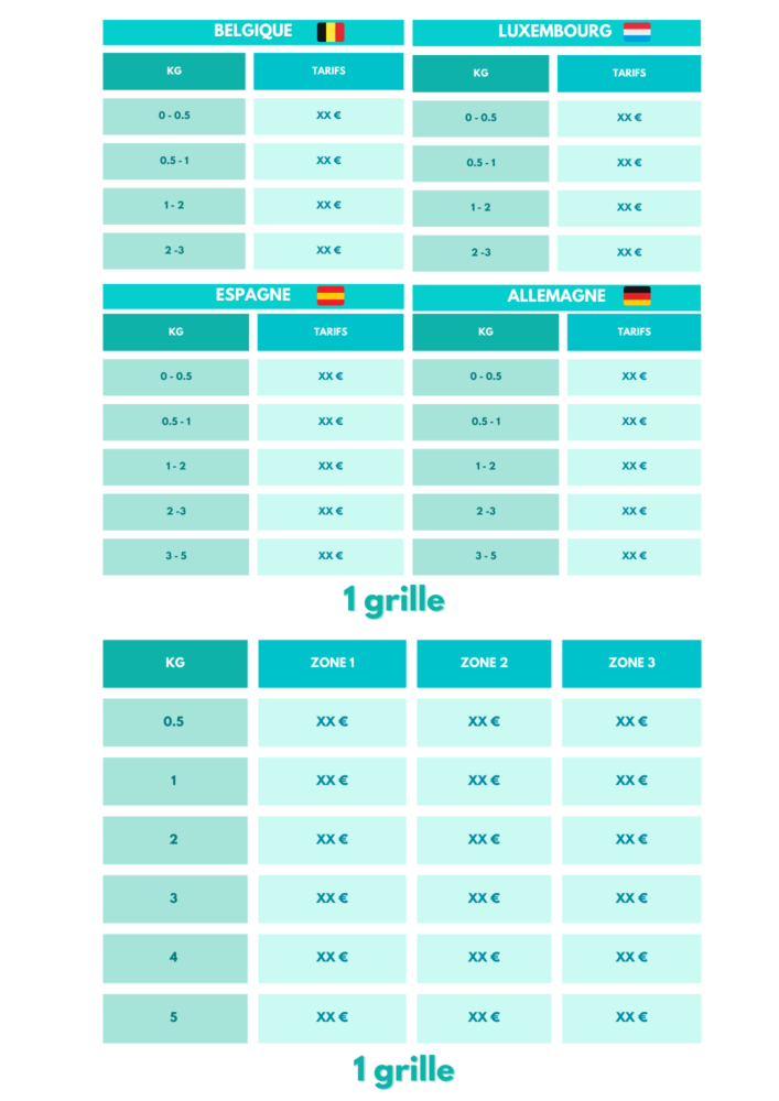
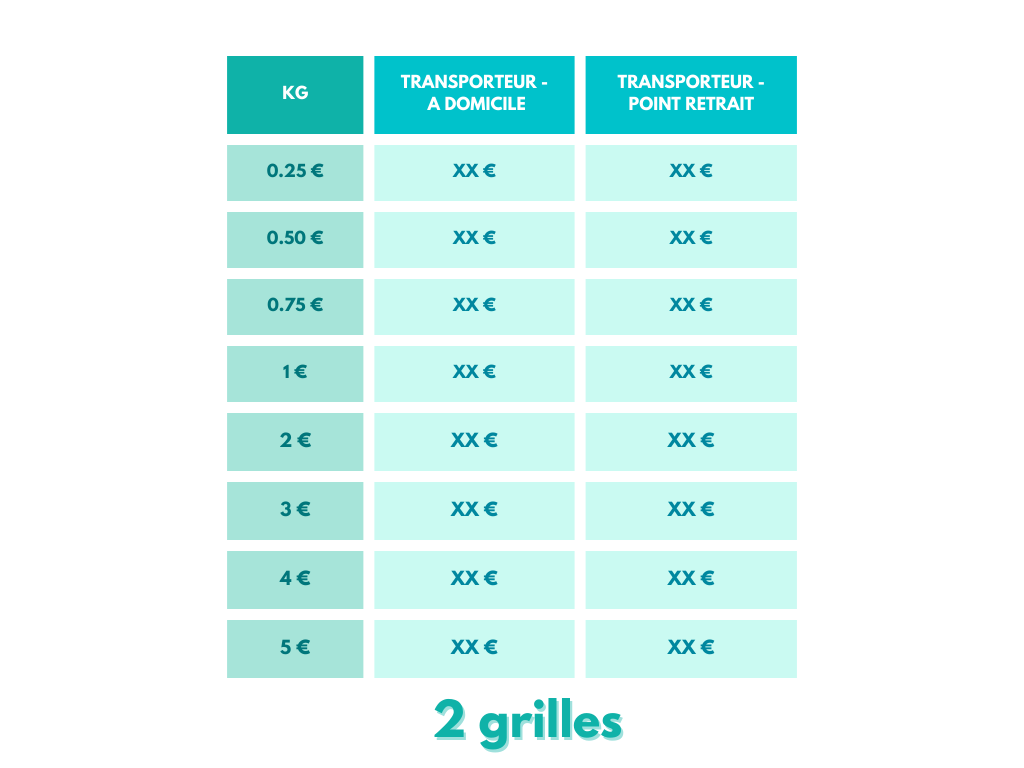
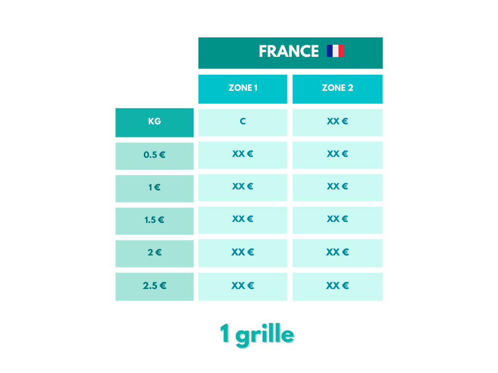
Quelques exemples de grilles tarifaires :
Bien plus qu’une simple comparaison tarifaire, de nombreux KPIs sont également mis à disposition pour faciliter vos prises de décision. Les grilles comparées sont analysées et restituées sous forme de graphiques pour faciliter la lecture.
Voici les conditions :
👉Sur notre plateforme, vous avez la possibilité de déposer 10 grilles tarifaires.
👉Vous pouvez comparer jusqu’à 5 grilles simultanément.
👉Sur 10 grilles déposées, vous pourrez donc effectuer pas moins de 627 comparaisons.
👉Tous les semestres, le compteur se réinitialise. Vous aurez donc de nouveau la possibilité de déposer 10 grilles et commencer de nouvelles comparaisons. Le crédit de modélisation non utilisé durant le semestre précédent sera “perdu”, il n’est pas cumulable.
👉 Vous pourrez toujours consulter vos anciennes grilles sur la plateforme.
Vous ne pouvez pas déposer un fichier contenant plus de 10 grilles, il faudra choisir quelles grilles vous souhaitez réellement modéliser pour ne pas dépasser votre crédit de modélisation gratuit. Bien sûr, vous pourrez également souscrire à une offre payante pour modéliser toutes vos grilles !
La facturation d’une grille ne correspond pas à la forme d’un fichier ou à une feuille Excel.
Comment analyser vos grilles ?
Une fois la modélisation faite, vous pouvez commencer l’analyse de vos grilles.
Vous allez retrouver quatre éléments : le scope commun, le classement, les filtres et les résultats.
Voici comment analyser chaque élément :
👉Le scope commun : Il représente la similitude des éléments présents sur vos grilles. Par conséquent, si vous comparez deux grilles dont les flux sont totalement différents, votre scope sera de 0%. Toutes les analyses des quatre éléments présentés ici seront faites sur ce scope commun.
👉Le classement : Il vous aide à ordonner les transporteurs en fonction de leurs prix.
Exemple: Le transporteur 1 apparait à 78% et le transporteur 2 à 22%. Cela signifie que T1 est moins cher sur 78% du scope commun.
👉Les filtres : ils servent à paramétrer les résultats. Vous retrouverez toutes les variables qui définissent vos grilles (le poids, le pays de départ, le pays d’arrivée…) Les filtres sont présentés sous forme de menu déroulant sélectionnable.
Attention : suivant le nombre de filtres non sélectionnés, un graphique différent apparaîtra dans les résultats.
Plusieurs résultats sont alors possibles en fonction des différents filtres choisis :
💡 2 variables non sélectionnées = une Heatmap apparaît.
La représentation graphique nommée Heatmap permet une analyse macro de la comparaison, à 2 dimensions, une variable en abscisse et une seconde en ordonnée.
Chaque case représente un ensemble de prix par rapport aux variables fixées ainsi qu’aux conditions associées à la ligne et à la colonne du graphique.
La couleur de la case correspond au transporteur le moins cher selon l’ensemble des variables fixées/sélectionnées auparavant. La case apparaîtra grise s’il y a une égalité tarifaire.
En passant la souris sur une case, vous pourrez observer les tarifs de l’ensemble des grilles comparées.
La Heatmap vous permet en un coup d’œil d’analyser un nombre élevé de flux et de repérer quel transporteur est le moins cher dans quelles conditions et les tendances annoncées.
Prenons l’exemple ci dessous :

Nous pouvons rapidement constater que la grille 1 est la moins chère dans une majorité de département en dessous de 10 unités envoyées, notamment dans la région parisienne. Par ailleurs, pour 1 unité, peu importe la destination, la grille 2 reste la moins chère. Pour les départements 30 / 31 / 33 / 34, la grille 1 sera la moins chère.
De multiples analyses peuvent être faites grâce à ce type de représentation.
💡 1 variable non sélectionnée = un Bar Plot apparaît.
La représentation graphique nommée Bar Plot dépend d’une seule variable fixée en abscisse du diagramme en barre (l’ordonnée sera toujours le prix).
En fixant une variable supplémentaire par rapport à la Heatmap, il permet d’avoir un niveau de détail supplémentaire et ainsi réduire le scope de l’analyse.
Prenons l’exemple ci dessous :

Précédemment, nous avons remarqué avec la Heatmap que la grille 2 est la moins chère pour 1 unité. Nous pouvons imaginer que la différence de prix avec la grille 1 soit minime. Afin de s’en assurer, nous fixons la variable unité à 1 et laissons la variable département non remplie. Cette dernière apparaît donc sur l’abscisse.
Nous constatons que la différence entre la grille 1 et la grille 2 est assez importante, à l’exception des départements 38, 73 et 74.
Nous pouvons imaginer une seconde analyse sur un département précis. Un chargeur expédie sa marchandise essentiellement dans le département 94. Dans ce cas, nous fixons la variable département (94) et nous constatons la variation des prix avec l’apparition du Bar Plot :

Grâce à la Heatmap, nous avons pu constater que la grille 1 était la moins chère en dessous de 10 unités. Le Bar Plot nous a permis d’affiner notre analyse, notamment concernant la tranche d’unités de 3 à 8, où la grille 1 se trouve la moins chère, pour une différence tarifaire minime avec la grille 2. Il est alors légitime de se demander si cela vaut le coup de solliciter un second transporteur pour si peu de différence.
Enfin, on remarque également que plus les unités augmentent, plus l’écart entre la grille 1 et la grille 2 se creuse. Si nos flux se composent majoritairement de nombreux colis, la grille 2 est plus avantageuse. A l’inverse, si notre activité est composée de moins de 10 colis par expédition, d’autres éléments pourront rentrer en compte pour faciliter la prise de décision. Par exemple, penser à la gestion d’un panel de plusieurs transporteurs du côté des opérations, la relation de confiance installée avec le prestataire déjà en place…
💡 0 variable non sélectionnée = un tableau de prix

A noter que plus vous sélectionnerez de variables, plus votre analyse sera ciblée.
Bien évidemment, nos équipes restent disponibles si vous avez la moindre question.
N’hésitez pas à nous contacter 😉